PART IV-(2) OF THE REPRESENTATION AND MEASUREMENTS OF URBAN TRANSPORTATION NETWORKS
In the final post of this series of study, all key variables will be adjusted by the weights of nodes and integrated into the machine learning model. This post will conclude with the findings of key nodes/edges (among all 456 nodes and 2070 edges in the network) which shall have the top priority for improvement or investment in transportation infrastructure.
PREVIOUSLY ON THE REPRESENTATION AND MEASUREMENTS OF URBAN TRANSPORTATION NETWORKS
So far, this study has looked closely into the betweenness centrality and the travel-time delay of the Taipei transportation network.
As one of the key measure of Social Network Analysis, betweenness centrality is an indicator to the probability of usage of nodes/edges when travelling within the network. In the previous post, the travel time delay is also introduced as an indicator to the sufficiency of the transportation infrastructure. A node/edge in the transportation network may have worse infrastructure if the travel time is longer during morning peak hours.
In the final post of this series of study, these two variables will be adjusted by the weights of nodes and integrated into the machine learning model. This post will conclude with the findings of key nodes/edges (among all 456 nodes and 2070 edges in the network) which shall have the top priority for improvement or investment in transportation infrastructure.
WEIGHTS OF NODES: PUSH AND PULL OF TRAFFIC FLOWS
Although betweenness centrality and travel time delay each represent part of the status of the transportation network, in some special cases, it may not be close to reality.
For example, the highest betweenness score of node is about 0.26 (see Part III), meaning that the node is in 26% of the shortest routes within the network. Assume that all origins and destinations of these routes account for only 1% of the City’s population. In such case this node may no longer need any further attention. If the worst spot for traffic jams only affects 1% of citizens, this spot may also not be the first choice for traffic improvement with limited resources.
Therefore, in this article, betweenness centrality and traffic time delay will be further adjusted by to the demand and supply of traffic flow.
Supply of Traffic Flow (The Push): People Who Live There
Transportation arises from the needs (work, school, shopping, etc.) of people to move from one place (origin) to another (destination). The greater the number of residents at the origin, and the more trips generated.
Data on the number of residents in all villages in Taipei City have been obtained in Part II of this series, as shown in the figure below.
It should be noted that the information provided by the government is the number of residents registered in the area, whether or not they are present. Since the study focuses on the transportation during the morning rush hour, a more accurate data would be the population who actually reside there and are employed. However, there’s no relevant information from the government.
Demand of Traffic Flow (The Pull): People Who Work There
The movement of people generates trips, and work trips has major attention in transportation forecasting modelling.
The number of job posts creates the demand of traffic flow, which “pulls” people from where they live to where they work. The more the number of employment at a place, the more work trips there are destined there.
Below table shows the number of employment in each administrative district of Taipei City at the end of 2016.
| District |
Primary |
Manufacturing |
Service |
Total |
| Songshan |
– |
19,179 |
203,011 |
222,547 |
| Xinyi |
– |
14,219 |
171,928 |
186,229 |
| Daan |
– |
27,717 |
213,504 |
241,877 |
| Zhongshan |
59 |
31,680 |
295,092 |
326,831 |
| Zhongzheng |
22 |
17,044 |
158,254 |
175,320 |
| Datong |
– |
9,411 |
72,809 |
82,242 |
| Wanhua |
– |
4,909 |
50,029 |
55,052 |
| Wenshan |
– |
4,174 |
32,206 |
36,608 |
| Nangang |
– |
12,758 |
76,982 |
89,740 |
| Neihu |
– |
53,374 |
176,781 |
230,155 |
| Shilin |
– |
16,497 |
59,638 |
76,644 |
| Beitou |
– |
19,367 |
47,851 |
67,218 |
| Source: National Statistics, Taiwan |
|
|
|
|
Unfortunately, a more detailed information at the village scale is not available. Next, this study will further discuss how to use existing data to estimate the number of employment.
ESTIMATES OF VILLAGES’ EMPLOYMENT
Methodology
The difficulty of obtaining finer-scale statistical data is a common problem in geographical studies and therefore alternative techniques have been developed to address the problem.
Lwin and Murayama (2009) and Teh et al (2019) used building floor space as a proxy for estimating the building population.
Although this method has limitations such as different floor space per person required by industries, it is still a decent indicator for comparison of population within a relatively homogeneous geographical area.
This article will estimate the villages’ employment within each administrative district by the floor space of employment-related land uses. The estimation of the employment can be specified as:
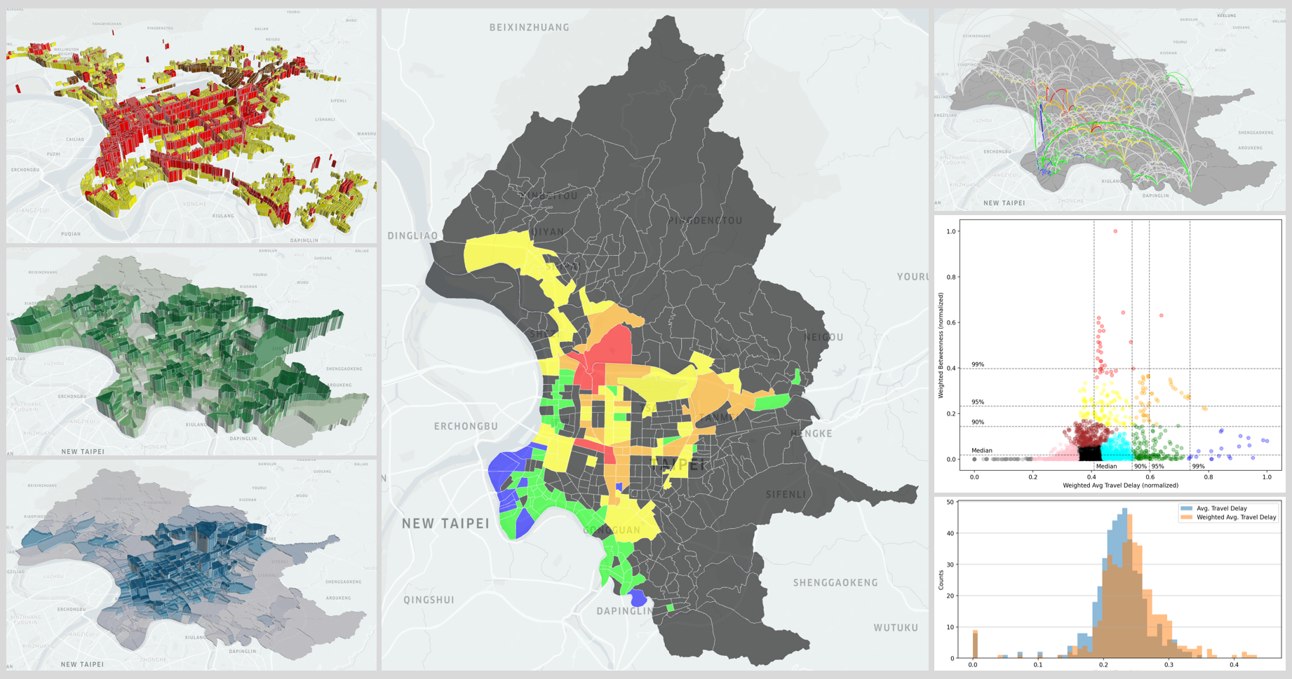
The zoning system of urban planning in Taipei City is similar to that of the United States. The land uses related to employment are commercial and industrial zones. However, lands in Taipei City is highly mixed-use. Certain types of residential zones allow high-intensity commercial use, which therefore shall also be considered. Below table shows the three employment-related land uses and their sub-types.
| Zone |
Commercial |
Industrial |
Residential (mixed use) |
| Type |
All |
All |
Type 3 & 4 (including all sub types) |
| Color |
Red |
Brown |
Yellow |
The floor area is calculated by multiplying the land area of the lot by its floor area ratio (FAR). Unfortunately given that the Taipei City Government does not provide the FARs of all land lots, this study needs to find the correct ratio for each lot. And this is not an easy task.
There are a large number of detailed plan (細部計畫) changes in Taipei City. In lots of cases the land use changes but the FAR remains the same or changes to a different ratio from the general case specified in the regulation. Such type of land use will be classified as “special” subtype, and the FAR of the lot can only be found within each detailed plan accordingly.
After completing the hustle of looking into the FAR of hundreds/thousands different land lots, this study puts the findings in below map, showing commercial zones (red), industrial zones (brown), and mixed-use residential zones (yellow) in Taipei City. The height of the lot represents the FAR.
Calculation of Floor Area of Each Village
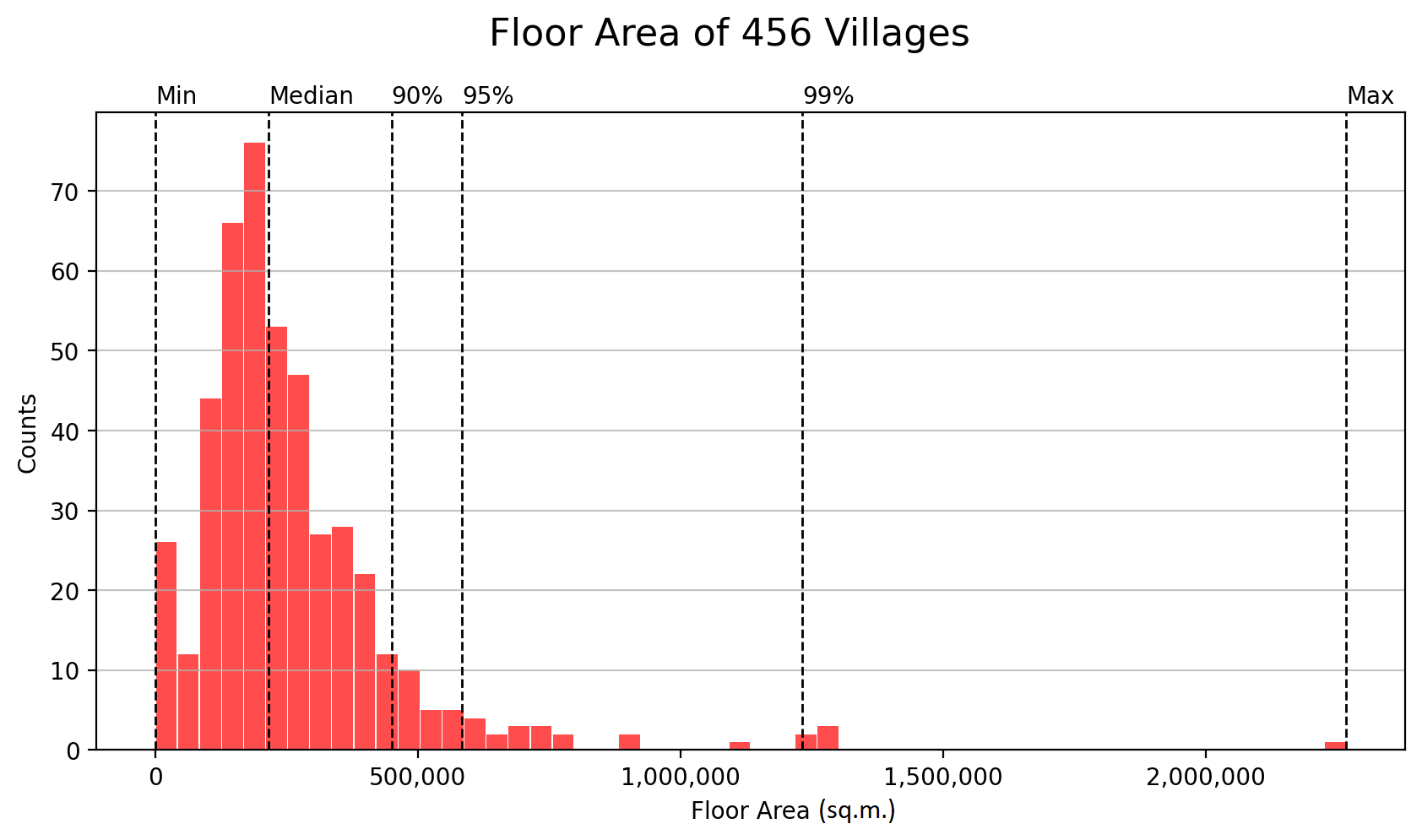
The employment-related floor area is added up at the village scale for the 456 villages. Most villages have the floor area of less than 500,000 square meters, with a median of 215,000 square meters. There are 17 villages that have no employment-related floor area, while Huyuan village in Neihu District has a floor area of 2.3 million square meters, far exceeding that of all other villages. The distribution is shown in the figure below.
Estimates of Villages’ Employment
The following table shows the number of floor area, employment and the villages under each administrative district. The number of employment in each village is calculated using the employment of its superior administrative district multiplying by the proportion of the floor area of the village to that of the district. It should be noted that there may be cases that one village has higher floor area but smaller employment than that of another village from a different district.
| District |
Floor Area (sq.m.) |
Employment (headcount) |
Villages |
| Songshan |
8,458,399 |
222,547 |
33 |
| Xinyi |
10,136,299 |
186,229 |
41 |
| Daan |
12,667,982 |
241,877 |
53 |
| Zhongshan |
13,574,970 |
326,831 |
42 |
| Zhongzheng |
9,590,381 |
175,320 |
31 |
| Datong |
7,301,876 |
82,242 |
25 |
| Wanhua |
8,537,236 |
55,052 |
36 |
| Wenshan |
8,374,671 |
36,608 |
43 |
| Nangang |
6,768,379 |
89,740 |
20 |
| Neihu |
13,021,455 |
230,155 |
39 |
| Shilin |
10,359,894 |
76,644 |
51 |
| Beitou |
9,704,627 |
67,218 |
42 |
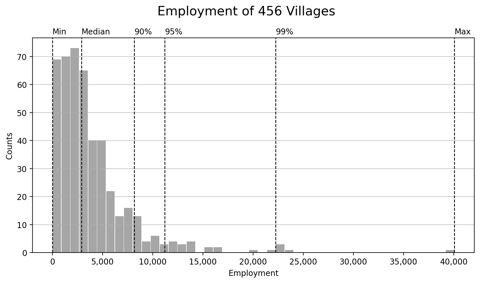
The figure below shows the distribution of employed population in 456 villages. The number of employment in most villages is below 10,000 headcounts, with a median of 2,894. Huayuan village in Neihu District again has the most employment (40,065 headcounts).
It is worth noting that there is no employment in the aforementioned 17 villages without related floor area, naturally. This does not mean that there is no working population in these villages in the real world. Nevertheless, its contribution to the work trips is simply negligible.
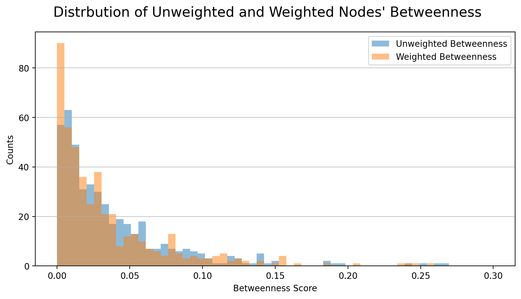
ADJUST BETWEENNESS CENTRALITY AND TRAVEL DELAY BY NODES’ WEIGHTS
Now that we have obtained the resident population (the supply of work trips) and the employment population (the demand of work trips) in 456 villages, we can use them to weight the 456x455 routes and recalculate the centrality and traffic-time delay. Simply put, among these 207,480 routes, as long as there is no residents at the origin village, or no employment at the destination, this route would have no significance within the transportation network, since it generates next to none work trip.
Please note that in the trip distribution model (the second step of the conventional transportation forecasting process), a travel cost function (time, money, distance, etc.) is also constructed to simulate the utility function of human’s behavior and calibrate the trips generated in each cell of the O-D matrix. However, such function requires a very large amount of data for model training before it can be used, meaningfully.
Weighted Betweenness
Nodes
Below models show respectively the calculation of unweighted and weighted betweenness centrality (BC) of nodes (villages). The formula for unweighted BC is slightly different from that has been used in the first part of the study. The reason is that after taking into account of the shortest paths in the real world in Part II, there is always only one shortest path between any pair of nodes. Thus there is no need to consider the case of more than 2 shortest paths between two nodes and the model is rewritten and normalized accordingly.
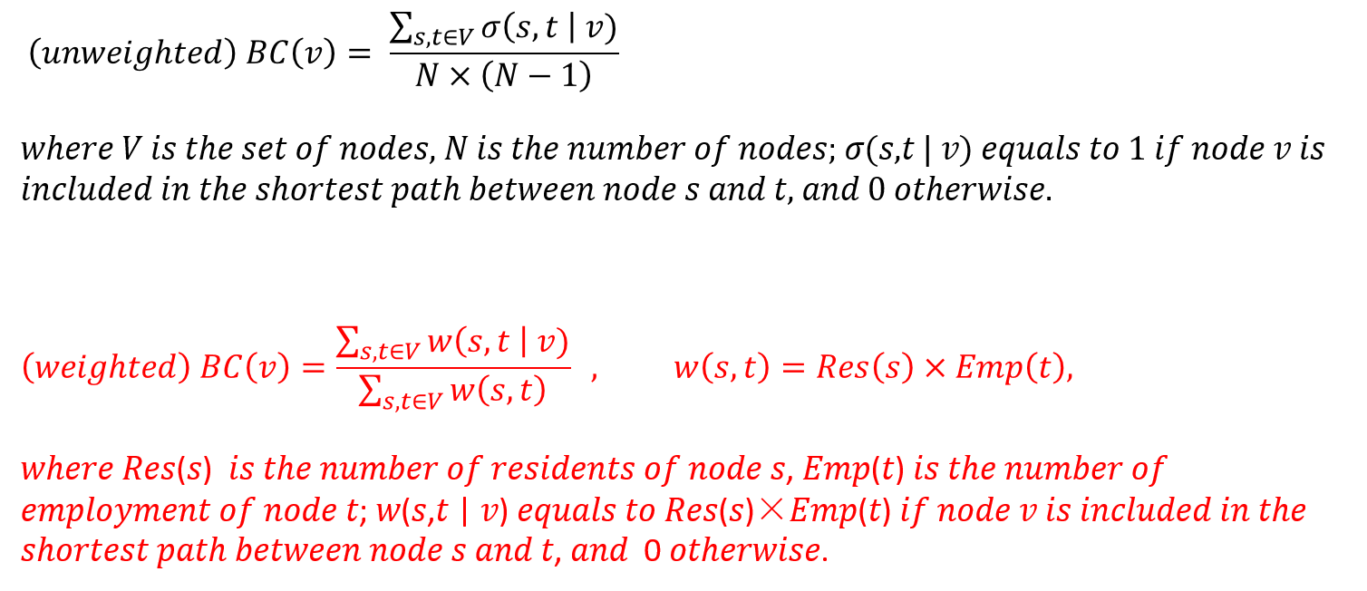
The figure below shows the distribution of nodes’ unweighted and weighted betweenness centrality. The maximum values of the two distributions are not much different (from 0.266 to 0.257, a decrease of 3.2%), while the median decreases a lot (from 0.0246 to 0.0199, a decrease of 19%). The left-skewed distribution of unweighted centrality is even more left-skewed in the weighted distribution.
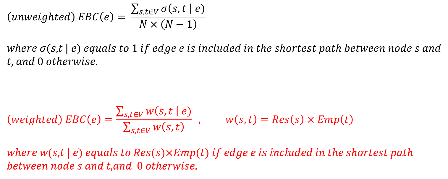
Edges
The models for calculation of unweighted and weighted edges’ betweenness centrality (EBC) are shown as follow. Similarly the model of unweighted EBC is revised since there is only one short path between any two nodes in the real world.
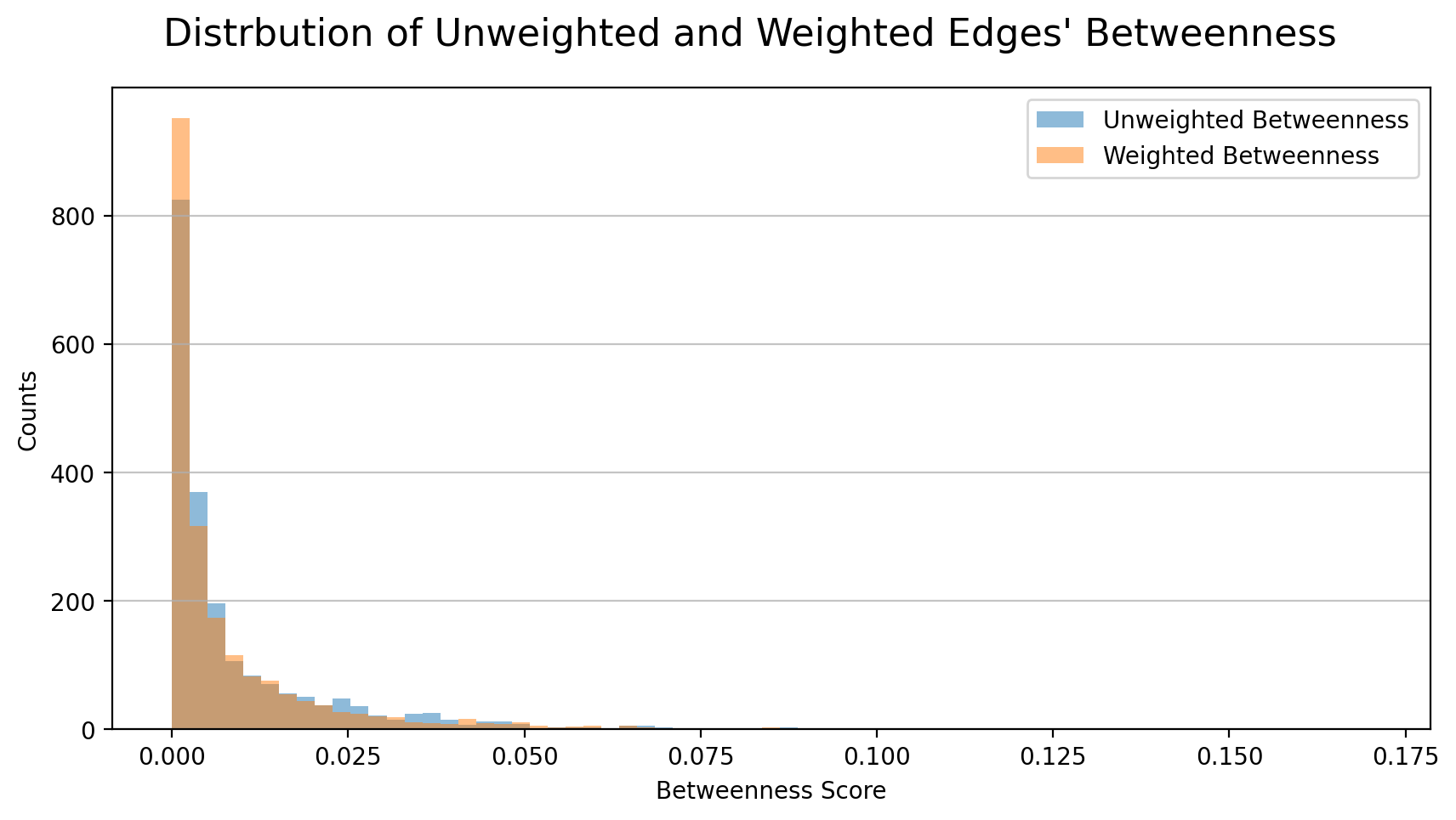
The figure below shows the distribution of unweighted and weighted edges’ betweenness centrality. The distribution is also more left-skewed while the maximum value increases by 24% (from 0.135 to 0.168) and the median decreased by 14% (from 0.00366 to 0.00315).
Travel Time Delay
Nodes
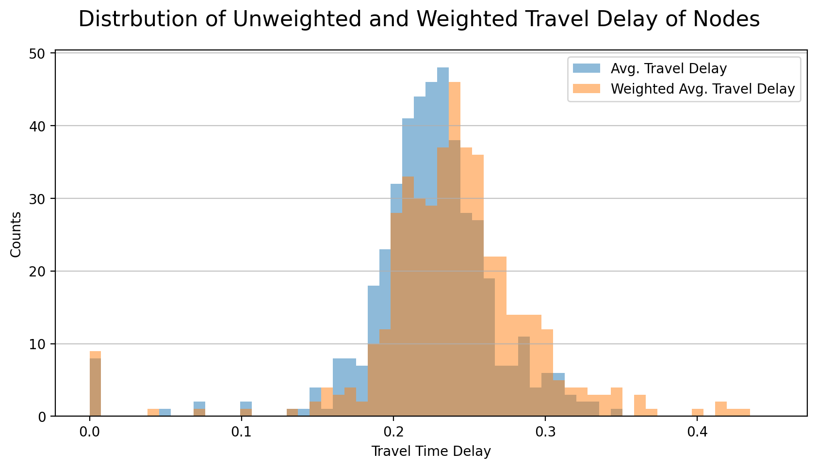
The following models show the calculation of the average travel delay (ATD), unweighted and weighted. The unweighted average travel time delay is simply the arithmetic average delay time of all routes that go through the node. Please note that in previous post the ATD is calculated using the sum of all routes’ real travel time that go through the node divided by the sum of base time, which is corrected here.
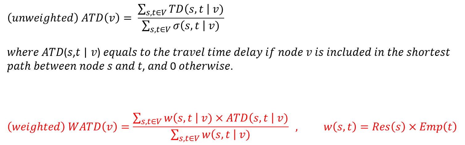
Below figure shows the unweighted and weighted average travel delay distributions of 456 nodes. The maximum value increases by 24% (from 0.344 to 0.427) while the median also increase by 6.7% (from 0.225 to 0.240).
Edge
Below models show both the unweighted and weighted average traffic delay of edges. Similarly, the model of unweighted traffic delay is corrected here.
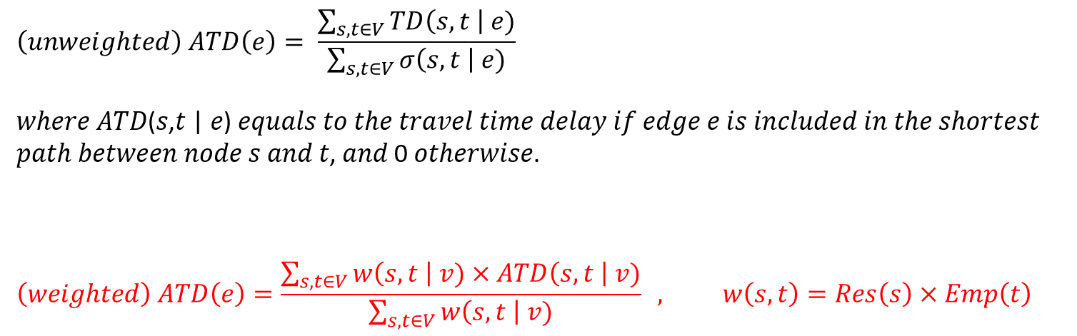
The distributions of unweighted and weighted edges’ average travel delay are shown below. The maximum value increased by 9.6% (from 0.508 to 0.557) and the median increased by 3.9%% (from 0.219 to 0.227).
ANALYSIS
Critical Transportation Nodes (Villages)
Data Description
Using both weighted betweenness centrality and weighted travel time delay as two variables to create a diagram can help better understand the data. Below figure shows the scatter plot of the 456 nodes where each data point represents one village.
There is not a clear linear relationship between these two variables. A node with high centrality does not always have a relatively poor traffic condition, and vice versa. However for those nodes whose percentile ranking is higher than 90% in either centrality or traffic delay, these two variables seem to be negatively related (linear, exponential, or other non-linear relationships).
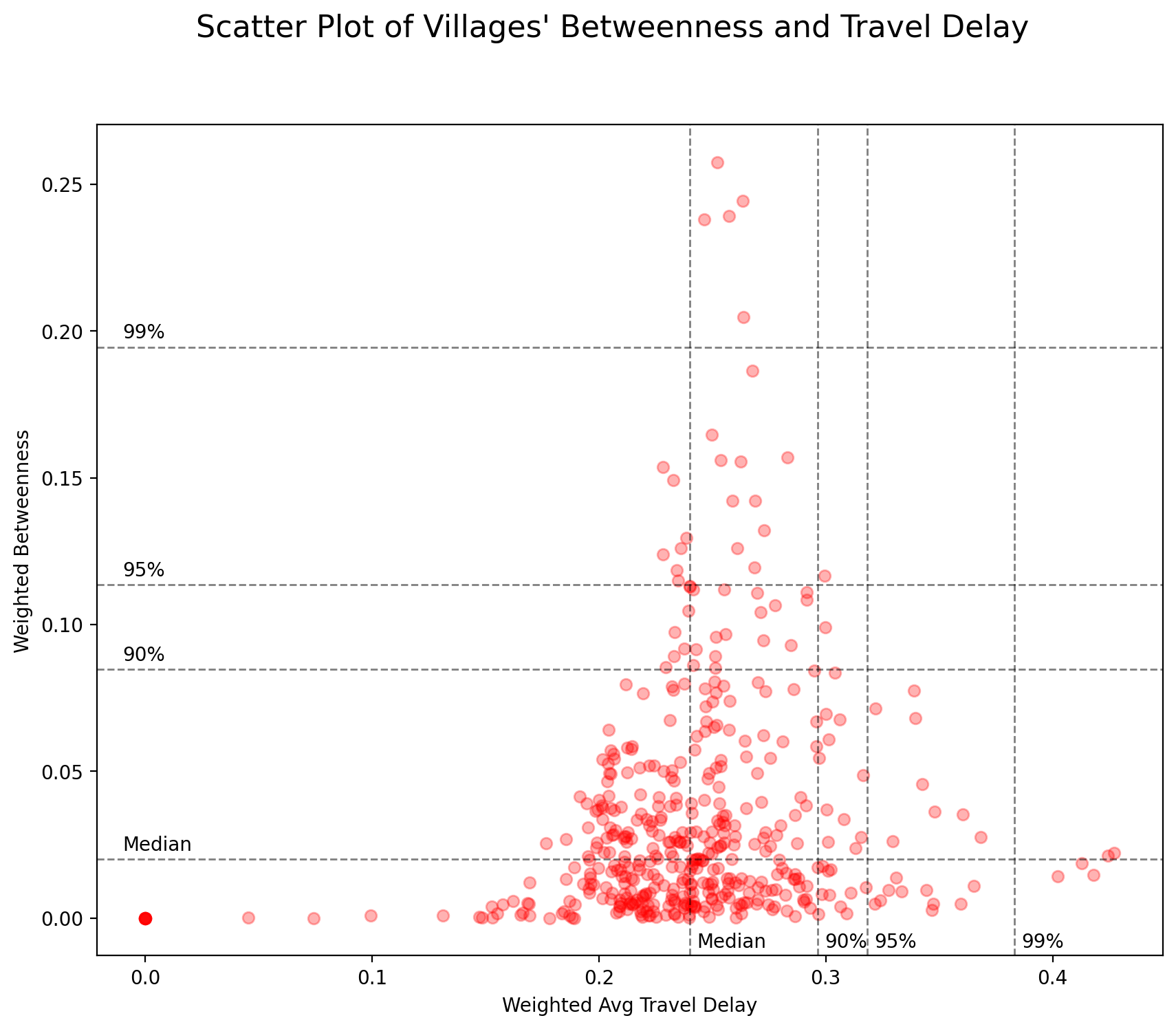
It is difficult to determine which nodes need immediate traffic improvement. Do nodes with high probability of usage (betweenness centrality) need further attention or those with poor transportation infrastructure (travel time delay)?
The answer to this question may not be scientific, but rather strategic or even political. For example, if the general public acknowledge the traffic delay during rush hours to be 30% longer than usual, there is no need to pay too much attention to 90% of the nodes whose traffic delay is less than 0.3. But if most people expect that the traffic delay shall not exceed 25%, the top priority is then to improve the traffic condition in those with higher centrality given their higher usage.
Nevertheless, given their own characteristics and needs, these nodes require different traffic improvement policies, and separating them into different categories would be a good start. This study uses k-means clustering method to divide all 456 nodes into k clusters. The nodes in the same cluster have more similar characteristics (here, centrality and traffic delay) than with nodes in other clusters, so that more appropriate policies could be customized to different clusters.
K-means Clustering
Featuring various machine learning and data mining algorithms largely written in Python programming language, scikit-learn library is used here for k-means clustering.
The parameters that will be used for training the model of the k-means clustering are set as follows. The two variables (betweenness centrality and travel delay) of the data are normalized before training. Please note that the algorithm does not make judgments whether one cluster is better or worse than the other. It simply “picks sides” for the data points and make sure that each data point is more similar with those within the same cluster.
KMeans(algorithm='auto', copy_x=True, init='k-means++', max_iter=300, n_clusters=10, n_init=10, n_jobs=None, precompute_distances='auto', random_state=0, tol=0.0001, verbose=0)
The result of the clustering is shown in below figure. There are clear differences in both centrality and traffic delay between clusters, as the algorithm is designed for.
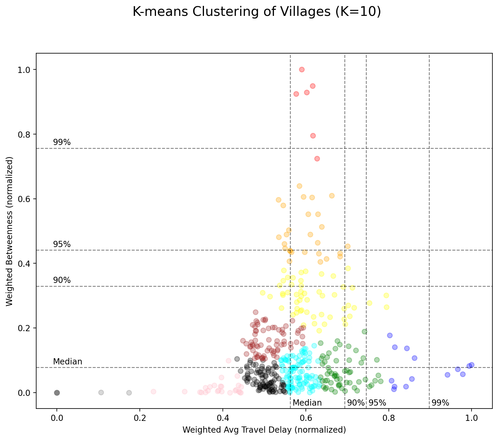
Judging from the result, at least five clusters (red, orange, yellow, green, and blue) may require further attention. They are closer to the outer side of the diagram and have higher value of either betweenness score or travel delay.
Among these clusters, the red one has the highest centrality and the blue one has the worst traffic delay time. While the two clusters are at each end of the spectrum, the others (orange, yellow, and green) are scattered along the spectrum.
Below map shows how the data points within these clusters locate on the map. The nodes in red cluster are located close to the city center while those in the blue clusters are at the gateway to/from the adjacent county.
There seems to exist a pattern of how nodes from different clusters are connected. For clusters that are next to each other in above diagram, their data points are more likely to be connected geographically. And data points from different ends of the spectrum (red and blue) are always separated.
Critical Transportation Edges
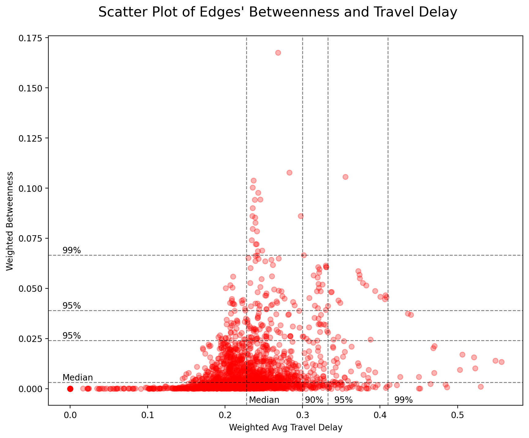
Data Description
Below figure shows the scatter plot of 2,070 edges which connect 456 nodes in the network. Each data point represents one edge’s weighted betweenness centrality and weighted travel delay. The distribution is very similar to that of nodes. The two variables do not show a clear linear relationship, and for those edges whose percentile ranking is higher than 90% in either variable, the negative correlation between the two variables seems to be more obvious than the distribution of nodes.
K-means Clustering
Similarly, K-means clustering algorithm is used to partition edges into k clusters. The parameters for model training setting are set the same as that of the node. The following figure shows results of the clustering.
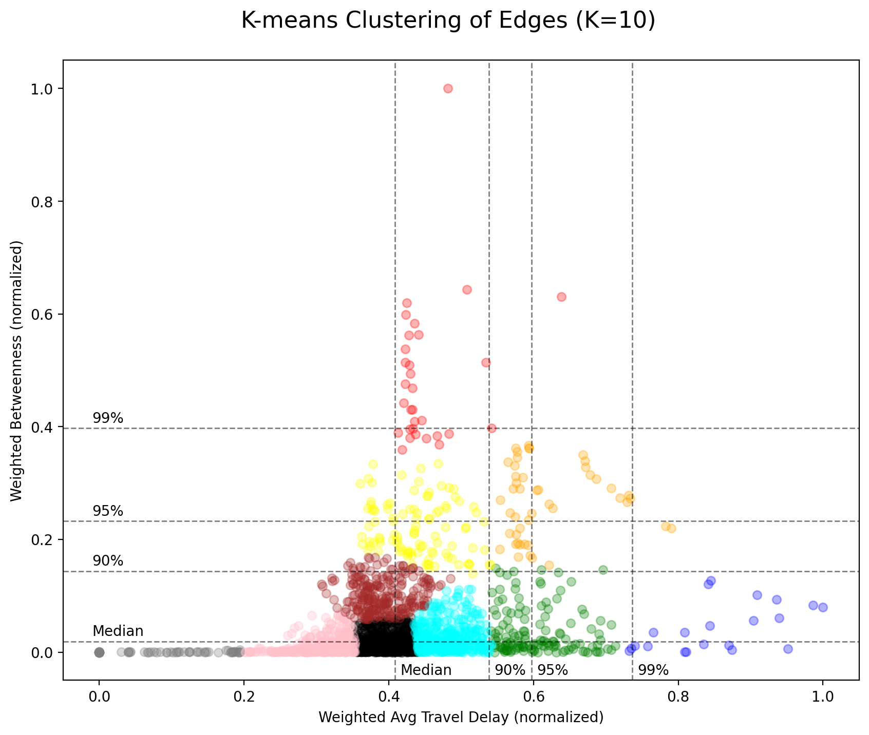
The red cluster is the one with the highest centrality and the blue one is with the worst travel delay, while the orange, yellow, and green clusters are scattered in between the spectrum. However, it is worth noting that, unlike the result of nodes’ clustering, the orange cluster here (rather than the yellow and green ones) seems to be as important as the red and blue clusters, if there does exist an importance (utility) function determined by the two variables.
The figure below shows how these clusters of edges locate geographically. Again for clusters that are next to each other in above diagram, their data points (edges) are more likely to be connected on the map while red and blue edges are hardly connected. Please note that the edges are bi-directional and opposite edges could belong to different clusters. You may need to zoom in the map and see their represented clusters closely.
There seems to exist a pattern between the geographical distribution of nodes and edges. Those nodes/edges with higher betweenness centrality are in the central part of the city while those with worse travel delay are at the gateway to/from the neighboring county.
A more detailed study shall be conducted to examine the traffic condition (road width, speed limit, lanes, socio-economic data, etc.) of nodes/edges within the same cluster and how they are different from other clusters. The causes of problems in the real world have to be investigated so that a more appropriate policy can be carefully customized for each different cluster accordingly.
Conclusion
After 6 posts published in last 3 months, this study has finally comes to the final conclusion. This series of articles is to put forward a new set of methods that, with limited data available unlike conventional transportation forecasting models, can still come up with meaningful traffic improvement suggestions.
The key question of the study is to answer:
Where is the critical area in Taipei City that needs immediate traffic improvement?
In Part I of the series, I constructed a Social Network Analysis method and measures for the analysis of the Taipei transportation network consisting of 456 villages as nodes connected by 2,070 edges. The centrality of these nodes and edges are calculated and discussed, while the nodes and edges with the highest betweenness scores (probability of usage while travelling in the network) are identified.
In Part II, the location of the nodes as well as the shortest paths between all pairs of nodes are adjusted to simulate the real-world transportation network more closely. And in Part III, the centrality scores of nodes/edges are recalculated and analyzed.
Until Part III, the study focuses on the centrality. In Part IV-(1), the study introduces the measurement of traffic-time delay to reflect the sufficiency of the real-world transportation infrastructure. And the weights of the node(resident population and employment population) in this post reflect the demand and supply that generate the traffic trips.
Taking the probability of usage, the sufficiency of infrastructure and demand/supply of traffic flow into consideration, this study identifies the nodes/edges in need of further attention. For those nodes/edges with higher value (percentile ranking > 90%) in either weighted betweenness score or weighted travel delay, a negatively correlation between the two variables is also found.
It is a strategic or even political issue regarding whether to allocate limited resources to nodes/edges with higher betweennes score or those with poorer travel delay. It depends on the perception and preferences of the general public, policy makers and all other stakeholders, and requires another well-designed and sophisticated study to provide conclusive suggestions.
Having said that, we can still use the machine learning methods to provide more insights. By using k-means clustering algorithm, this study divides the nodes/edges into k clusters, where nodes/edges within the same cluster are more similar with each other than those from other clusters. Therefore, a more optimized and customized policy can be made to each and different cluster.
The conventional transportation forecasting model has a history of 70 years. To establish such model requires huge amounts of data for calibration of parameters and functions. By proposing a more “lightweight” method that requires far less data while still being able to provide insightful conclusions, this study offers an alternative and more responsive methodology in time that identifies where the problem may be geographically.
SOURCE CODES
All source codes used in this post can be found on Colab or my GitHub.
INDEX